In the Clients view, the Environment Assessment report shows the following resource consumption details for the client devices in the selected folder.
Clients Widgets
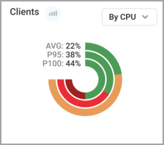
- Clients. You can select to view the Clients chart according to CPU or memory. By default, CPU is selected. The chart contains three concentric rings that show the percentage of items according to AVG (average), P95 (95th percentile) and P100 (maximum of average) resource usage utilization based on daily aggregation. The P95 of resource usage is based on 5-minute granularity, representing the resource consumption level that was exceeded only 5% of the time. The P100 of resource usage represents the highest average resource consumption level that was exceeded. These metrics offer a valuable insight into your organization's performance and capacity planning.
In the Clients chart, you can click the Insights icon to view a list of specific usage details of the hosts for the selected resource.
You can hover over a ring in the chart to show the percentage of items by stress level:
- Light Green: No stress.
- Dark Green: Low stress.
- Orange: Medium stress.
- Light Red: High stress.
- Dark Red: Critical stress.
You can click on the AVG, P95, or P100 metrics in the top left corner of the chart to view a Distribution graph for each data series, and the number of instances the metric is based on. Each graph shows the number of items for distribution of 30 days average per clients.
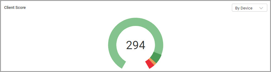
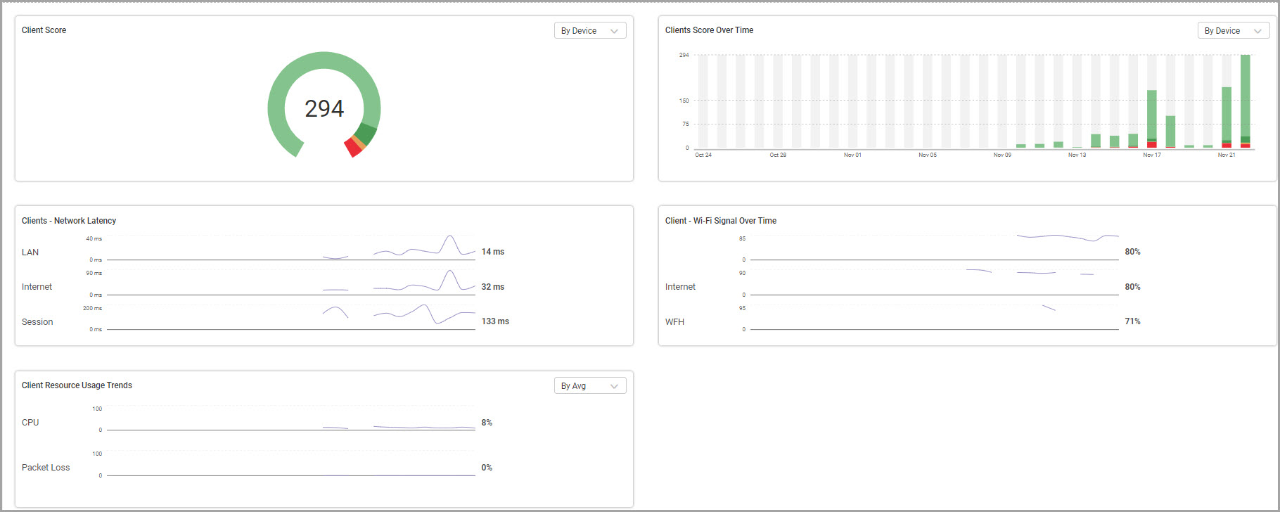
- Clients Scores. Shows total number of clients and overall health distribution according to stress level. Hover over a bar on the chart to view the score distribution for each stress level.
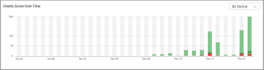
- Clients Scores Over Time. Shows overall health distribution of clients according to stress level, and the percentage of time per day. Hover over a bar to view the score distribution for each day.
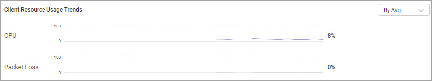
- Clients Resource Usage Trends. Shows charts of clients resource usage trends for CPU (%) and Packet Loss (%). You can view the charts according to average, P95, or P100. By default, average is selected. Hover over a data point in a chart to view the score distribution for each day. Click a chart name to open the Session Activity report.
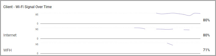
- Clients - WiFi Signal Over Time. Shows charts of top 3 client sessions WiFi signal strength (%) per day, for each WiFi network in your organization. Hover over a data point in a chart to view the score distribution for each day.
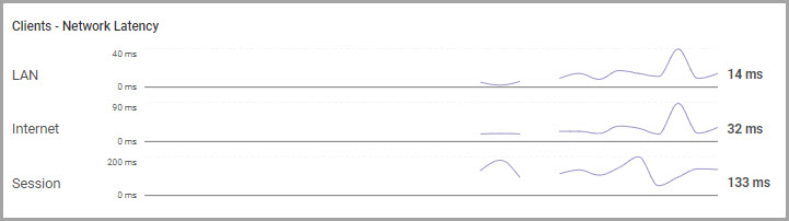
- Clients – Network Latency. Shows charts of client sessions network latency (ms) per day for LAN, Internet, and Session networks. Hover over a data point in a chart to view the score distribution for each day.