Use the Employees section of ControlUp's DEX platform to monitor employee activity and quality of experience. For example, you can use these dashboards to identify a decline in performance after a software update, or identify the root cause of performance issues reported by specific employees.
Employee scoring
Employees using devices with the ControlUp for Desktops Agent are automatically identified and appear in the Employees dashboards. To learn more about employee identification, and how to limit who is identified, click here.
An employee's experience is classified as perfect, good, fair, or poor based on their experience score, which ranges from 0-10:
- Perfect = 10
- 7 < Good < 10
- 3 < Fair <= 7
- 0 <= Poor <= 3
An employee's experience score is reduced when their system metrics meet the conditions set in a scoring profile. ControlUp provides default profiles, or you can create your own.
To ensure that short periods with significantly decreased experience don't go unnoticed, employee's are given a fair or poor experience based on a time threshold, rather than their average score. An employee's experience is classified as fair or poor if their experience score is within the fair or poor range respecively for more than 5% of their active time within the selected time period. The default threshold is 5%, but you can change it if you want to adjust the calculation to be more or less sensitive to short periods with decreased experienced. Learn more about threshold settings.
For example, consider an 8-hour workday. If an employee has a poor score for just 30 minutes in the afternoon, their overall experience for that day will be classified as poor because 30 minutes is 6.25% of their day, exceeding the default 5% threshold.
The experience classification is always based on the currently selected time period. If, in the example above, you were to view data only for the morning hours, the employee's overall score would not be classified as poor because the poor experience occurred outside of the selected time period.
Prerequisites
- ControlUp for Desktops Advanced license
- Windows or Mac devices with the ControlUp for Desktops Agent version 2.13 or higher installed. Note that due to differences in collected metrics, employee scoring might vary between different operating systems.
- End User Activity monitoring must be enabled. In the End User Activity settings page, you can configure which applications and URLs are monitored.
- If you use ControlUp for VDI & DaaS, there are additional prerequisites to show VDI data in the Employees view. Read this article for details.
- To view the Employees dashboards, you must have the permission Access Employees.
- To view employee activity events, you must have the permissions View Non-Security Related Events.
Overview
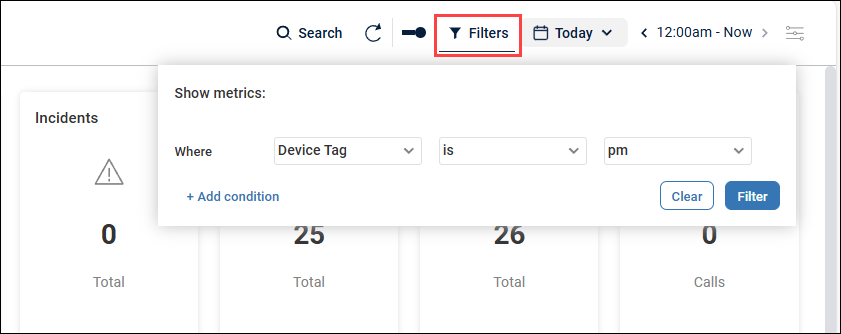
On most pages, you can apply filters to show data only from specific devices (for example, devices belong to a certain device tag).
The Overview page shows employee experience across your whole environment. You can use this page to answer questions like:
- How many unique applications are being used?
- Was employee experience in the HR department this week better or worse than the week before?
- What were the most common issues for employees in the HR department last week?
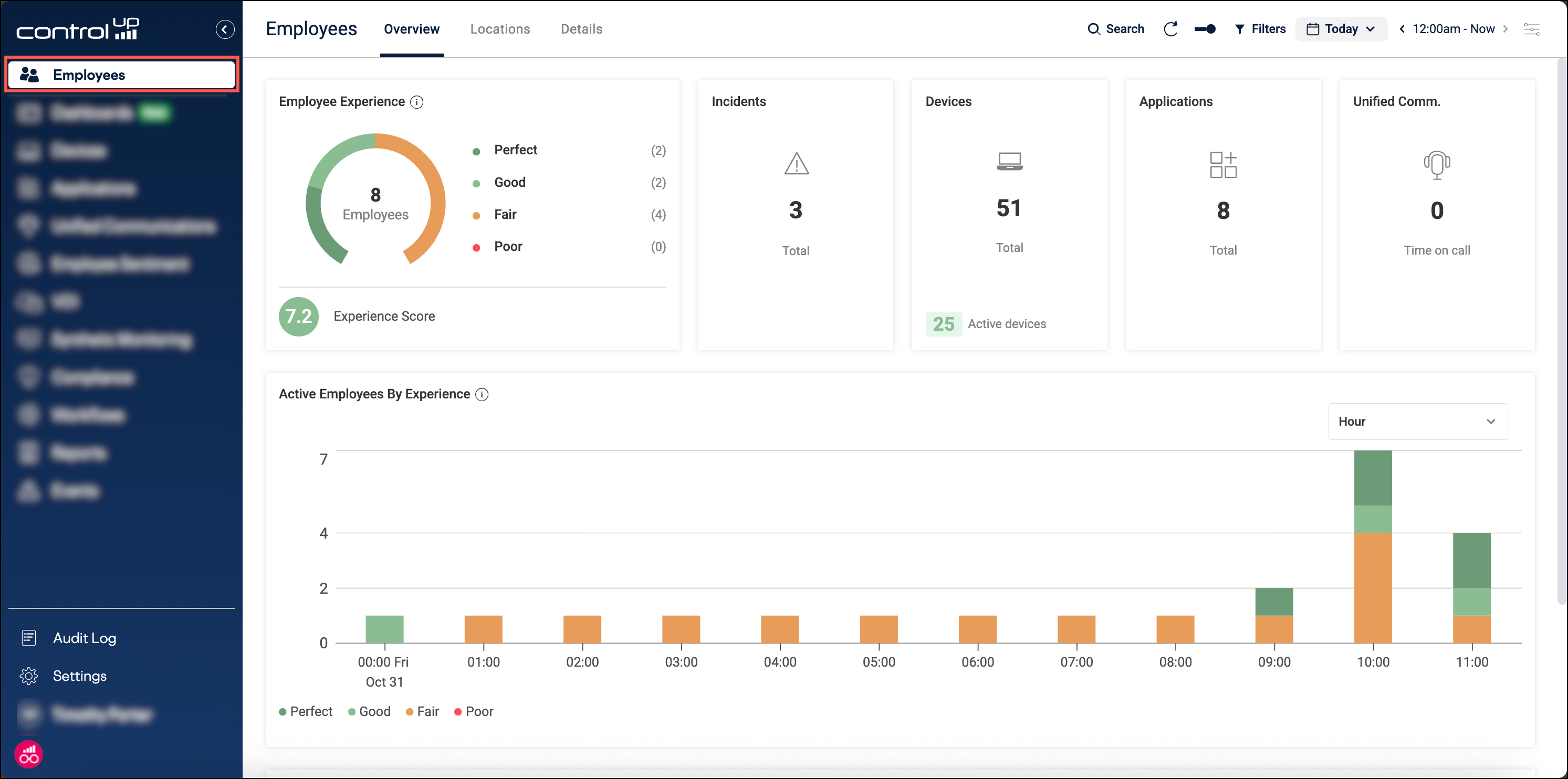
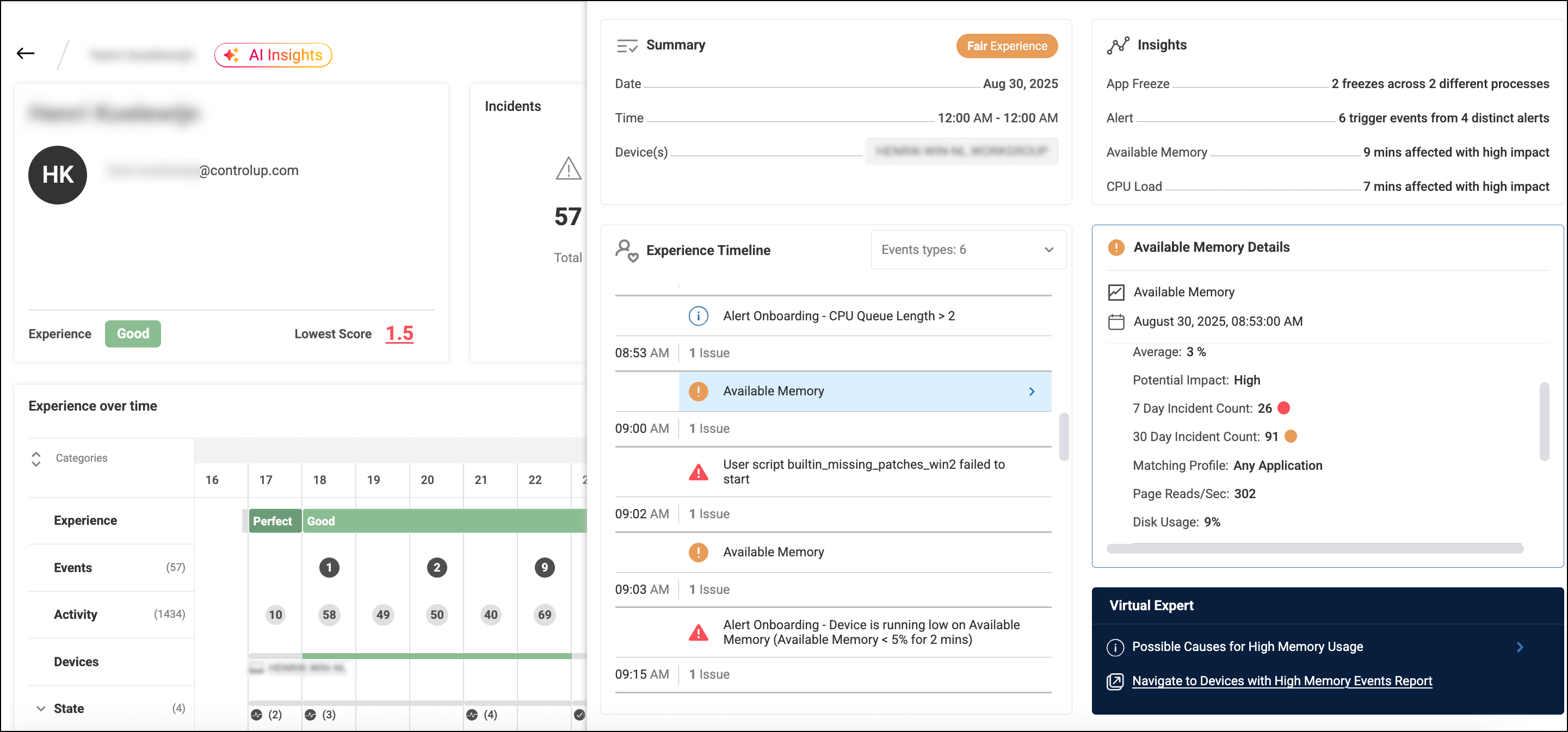
The Employee Experience widget shows the number of employees in each experience score category (perfect/good/fair/poor). The experience score at the bottom of the widget shows the overall experience score in the selected time frame, based on the number of employees in each category (perfect/good/fair/poor). Read above to learn more about experience score categories.
The Incidents widget shows the number of employees affected by each incident type (crashes, hangs, and freezes). Click on an incident in the widget to drill down and see more details. After drilling down, you can click on an app crash to drill down further and see more details about the crash.
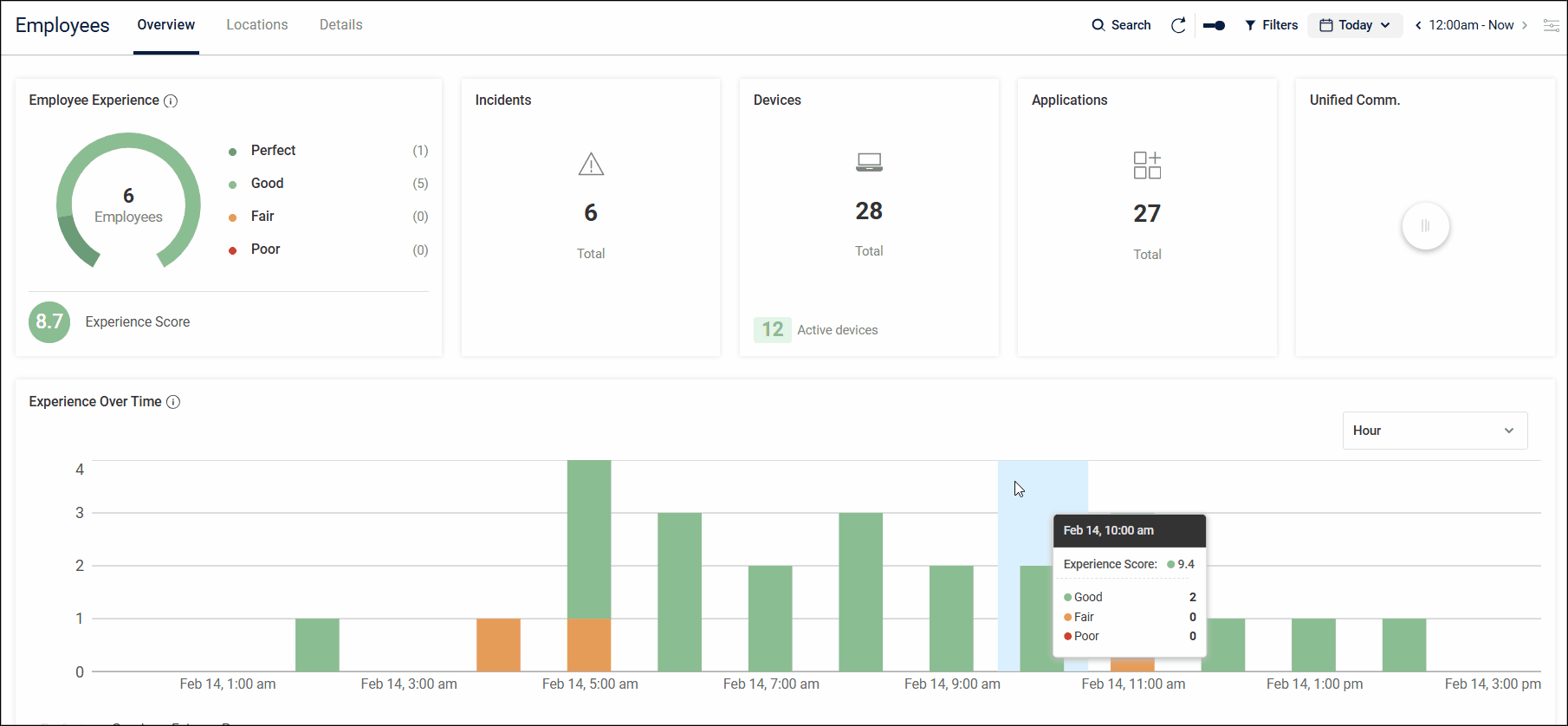
Experience over time
The Experience Over Time widget shows the number of active employees with details about their experience score. The colors in each bar represent the number of employees in each experience category (good/fair/poor). Hover over a bar to see detailed counts, and the average experience score during that time. Note that employees with a perfect score are excluded from this widget by default. You can use the legend to include employees with a perfect score. Read above to learn more about experience score categories.
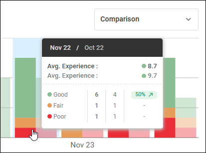
Click the dropdown at the top-right of the widget and select Comparison to compare the experience with the previous period. The previous period is based on your currently selected time period at the top-right of the page. For example, if you have selected "This month", then data from the previous month is overlayed on the widget so that you can compare the two months. You can hover over a data point to see a detailed comparison. In the image below, the comparison shows that between October 22 and November 22, the number of employees with a good experience is up by 50%.
You can click and drag on the chart to zoom in to a specific time period.
Incidents
The Incidents widget displays how many application crashes, hangs, or freezes occurred on each day. Click on the number of incidents drill down and see more details. After drilling down, you can click on an app crash to drill down further and see more details about the crash.
Location
The Location page shows the number of employees working in each city.
Click on a location to see number of employees with a good, fair, and poor experience score in that location. Click on a number of employees to see the list of employees.
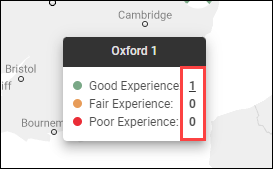
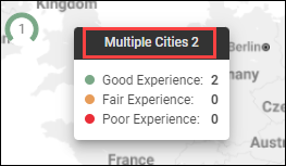
If you zoom out on the map, data from multiple cities is combined. To drill down to the list of employees in a city, you must zoom in so that only a single city is displayed.
Details
Use the Details page to see details for all individual employees in your environment.
Click on an employee in the grid to drill down into the details for that employee and their experience score and activity. The top of the employee details page has the following widgets:
- Incidents - The number of app crashes, hangs, or freezes.
- Devices - The number of different devices used by the employee.
- Applications - The number of different applications used (including desktop and web applications).
- Unified comms - The time spent in Microsoft Teams or Zoom calls.
- Productivity - The amount of time the employee was active. By default, an employee is considered idle if there are no keyboard or mouse events in 15 minutes (determined using GetLastInputInfo). You can customize the idle timeout duration for specific groups of devices using the User Idle Timeout setting on the Extended Settings page. If an employee is in a Microsoft Teams or Zoom call, then they are always considered active even if there are no keyboard or mouse events. The widget also shows the percentage of the employee's active time that was spent with a poor experience score. Read Employee Scoring above to learn about experience score classifications
Experience over time
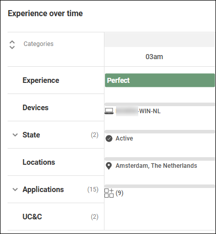
The Experience over time widget displays the employee's experience and activity throughout the time period selected at the top-right of the page.
If an employee had no incidents during a certain time frame in the widget, then their experience is Perfect. The employee activity data below that time frame is grayed out to visually indicate the absence of incidents.
If an employee had one or more incidents affecting their experience during a certain time frame in the widget, then their experience is Good, Fair, or Poor, depending on your scoring settings. The employee activity data below that time frame lets you quickly see the reason for the reduced experience. If a row is colored, it means that there was an incident related to that row. The row's color indicates the severity of the incident (green for Good, orange for Fair, and red for Poor).
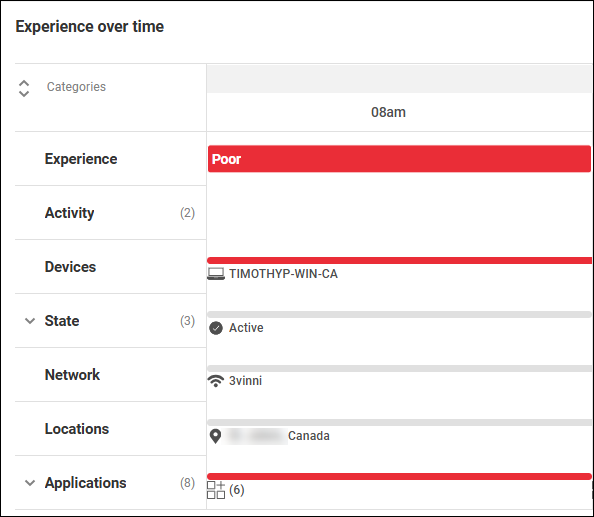
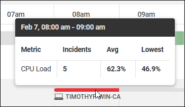
You can hover over any colored item in the widget to quickly see more information about the incidents.
The Experience over time widget contains the following rows:
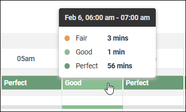
- Experience - The employee's experience score (perfect, good, fair, or poor) during the time interval. You can hover over the experience score to see a more detailed breakdown of the employee's score within that time frame. You can also click on the experience score to drill down into the Insights page.
- Incidents - Application crashes/freezes/hangs or BSODs. To see which applications were affected, drill down into the Insights page.
- Activity - Device power events such as shutdown or restart, and actions performed from ControlUp such as scripts or remote control sessions.
- Devices - The name of the device used by the employee. You can click on the device name to drill down into the details for the device.
- State - Session states such as idle, active, disconnected, and locked.
- Network - The type of network connection (wired vs. wireless) and the SSID name.
- Location - The employee's geolocation. Learn more about how device location is determined.
- Applications - The applications (web or desktop) used by the employee. Application usage is reported according to your End User Activity privacy settings. If an application isn't configured for monitoring, then its name is anonymized as a "non-business" application. Note that only web applications that are monitored by ControlUp for Apps can record incidents. Click here for more details. You can click on an application with incidents to drill down and see more details.
Employee experience drilldown
Click on an experience score in the Experience over time widget to drill down into more detailed information and insights. Read Employee Experience Drilldown for details.