Network Performance
- Print
- DarkLight
- PDF
Network Performance
- Print
- DarkLight
- PDF
Article Summary
Share feedback
Thanks for sharing your feedback!
Gain insight into the digital experience of your end users by analyzing network performance data in Edge DX.
View Network Performance Data
You can view network performance data and metrics in your organization for all devices and individual devices.
Use Case
To learn how to identify network related issues in Edge DX, use our interactive use cases guide.
View Network Performance Data for All Devices
In Home > Network, you can view widgets displaying device data and metrics for the end user devices in your organization for the displayed Date Range:

Additional details about the network performance widgets shown on the Network page are described in the table below:
| Widget Name | Additional Details |
|---|---|
| Each Latency by Device widget displays a bar chart showing the average latency values (in milliseconds) over the Date Range period for the specified target, for the five end user devices experiencing the worst performance. Hover over the bars in the chart to see the average latency value for each device. Each Latency by Device widget also displays two additional values: :
|
| Each Latency by ISP widget displays a bar chart showing the average latency values (in milliseconds) over the Date Range period for the specified target, for the five ISPs having the worst performance. Hover over the bars in the chart to see the average latency value for each ISP. |
| The Longest Traceroute Hops widget displays a bar chart showing the five longest traceroute hops (in milliseconds) occurring over the Date Range period. Hover over the bars in the chart to see the latency values for each of the hops. (See View Traceroute Details of Network Connections for more details.) |
| The Top ISPs widget displays a bar chart showing the top five ISPs used by the most end user devices. Hover over the bars in the chart to see the number of devices using each of the listed ISPs. |
| The WiFi Strength Samples widget is a gauge display of average WiFi strength data over the Date Range period. The gauge shows a breakdown of the collected strength samples into the categories Strong, Good, Weak, and Unusable. An average of the WiFi strength data over the Date Range period for all of the end-user devices is displayed in the center of the gauge. In Edge DX, WiFi signal strength is measured on a scale of 0-100, with 100 representing the strongest signal. The strength thresholds are configurable in Configuration > Settings > Device Dashboards. |
Latency by Device and Latency by ISP widgets are shown for three targets, two of which can be configured by the user. See Configure Multiple Latency Targets for details.
View Network Performance Data for Individual Devices
In the Devices section of the Edge DX User Interface, you can view various details about the managed devices in your organization, including network performance data. You can click on an individual device, or on one of the graphic displays shown in the grid for a device, to drill down and view additional device data on the individual device page.

On the individual device page, you can view network performance data and metrics for the individual device according to the displayed Date Range. Network Latency charts are shown for the following targets:
- 1 default target - 8.8.8.8 (Google's public DNS server).
- 2 user-configurable targets - See Configure Multiple Latency Targets for details.
The Network Latency charts display minute-by-minute network latency values (in milliseconds) for the default and configured targets, according to the Date Range displayed on the individual device page. You can change the Date Range by clicking the Date Range field, see Change the Date Range for details. The example Network Latency chart in the screenshot below shows network latency data for an end user device's network connection to Google's public DNS server (8.8.8.8) between 11:58pm on March 9th and 4:57pm on March 10th.
.png)
On the Network Latency charts, you can hover over a plot line (Latency to Target or Local Gateway) or the yellow dots along the timeline shown on the horizontal axis of the chart, to see the network latency details at different times along the timeline.
View Traceroute Details of Network Connections
The yellow dots spaced along the timeline shown on the horizontal axis of the network latency chart indicate that a Traceroute is available for the network connection at that time.
Click a yellow dot to view the Traceroute. The Traceroute Detail display opens:
.png)
On the Traceroute Detail display, you can see details about the network connection of a particular device at a particular time, including the details of the hops between the address of the end user device and the network target, e.g., 8.8.8.8, as shown in the above screenshot.
As shown in the screenshot, the traceroute details are shown in both a graphic format and a grid format. The differences between the two formats are listed in the table below:
| Traceroute Details | Graphic Format | Grid Format |
|---|---|---|
| Displayed | Displayed |
| Displayed | Displayed and Filterable |
| Displayed | Displayed and Filterable |
| Displayed | Displayed and Filterable |
| Hop Time displayed for individual hops | Cumulative Hop Time displayed |
Configure Multiple Latency Targets
As explained above, network performance data for end user devices is collected for multiple targets:
- 1 default target - 8.8.8.8 (Google's public DNS server).
- 2 user-configurable targets.
To configure multiple latency targets for network performance data collection and display, perform the following steps:
- Click Configuration >Settings >Network Latency.
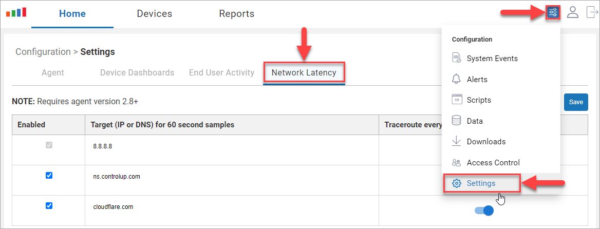 In the target configuration table on the Network Latency page, you can set two custom targets for network latency sampling, in addition to the default target 8.8.8.8 (Google's public DNS server). The network latency to the targets is sampled every 60 seconds.
 - Click on one of the two clickable fields in the Target column, and enter an IP or DNS target that you want to sample.
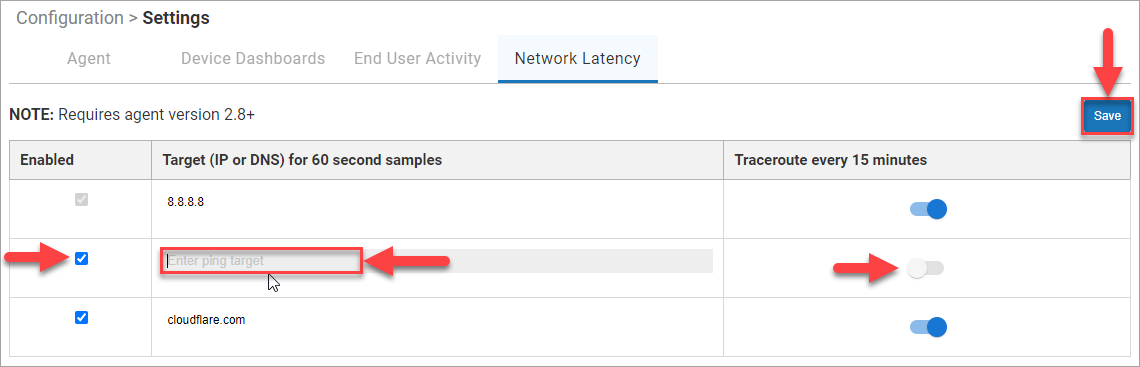
- In the Traceroute every 15 minutes column, click the toggle switch to enable tracking of the traceroute to the target every 15 minutes.
- Click the checkbox in the Enabled column to enable sampling of the target. When the checkbox is checked, you can click it to disable the target sampling.
- Click Save to save your changes.
 In the target configuration table on the Network Latency page, you can set two custom targets for network latency sampling, in addition to the default target 8.8.8.8 (Google's public DNS server). The network latency to the targets is sampled every 60 seconds.
Was this article helpful?