The ControlUp VDI App UI offers you powerful real-time monitoring and comprehensive analysis in a hosted web application. Accessing via a web interface means there's less resource consumption on the endpoints that are logging in and viewing the data, providing you and your users a leaner, more performance-driven experience.
The VDI App provides a wide range of functionalities including:
Dashboard widgets that have been configured to provide you the latest, most relevant information on your environments, right out-of-the-box.
Discovery with topology view of your environment that displays the relationships between components. Discovered components are displayed dynamically. You can drill down from each component to access detailed performance information.
Drill down from any component in the topology or dashboard widgets with powerful contextual navigation built from our recommendations engine.
Data grids from the Real-Time DX Console with a modern look and feel.
Historical Trends for metrics related to machines and hosts.
Reports available directly in the VDI App UI interface. You can now view new, constantly updated data pipeline reports, and older data in legacy reports.
For an overview of the updates included in the newest version of our VDI App, watch our video.
How to Access the VDI App
To learn about login methods, prerequisites, and permissions, see here.
Navigation
In the DEX platform, click the VDI icon on the left side menu of available apps.

Use the navigation tabs on the top to select how the data is displayed and which data to display:

Overview opens dashboard.
Details opens topology view.
Tree
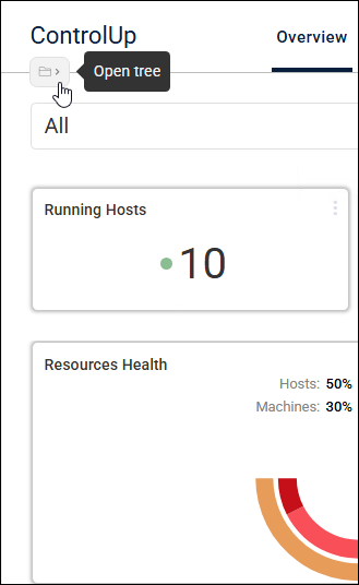
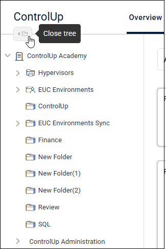
Your organization is represented in the same folder tree structure as in the Real-Time DX Console. You can open and close the tree with an open tree icon on the left side next to the page navigation icons.
The data in the Dashboard and Discovery views are displayed on the VDI App, based on the context you selected in the organization tree. For example, if you set up a folder in the Console to represent the components that belong to a certain team in your organization, when you highlight that folder in the VDI App, only the performance and monitoring data for those components are displayed in the topology, widgets, and columns.
When a folder is highlighted in the tree affecting the data displayed, the following message displays what data you are viewing: Focusing on: < folder name >.
Dashboard View
The dashboard provides out-of-the-box widgets with easy-to-understand visual indicators of many of the metrics, performance indicators, and details found in ControlUp. These widgets provide you more insight so you can better understand the performance and status of your whole environment. The out-of-the-box widgets include the following:
Single statistics. For example, the number of running hosts, average logon duration in seconds, datastore free space in terabytes.
Gauges. Computed based on data types, for example, session and process stress levels.
Bar graphs. Categorized data on specific metrics, including:
Top 5 processes by CPU usage
Top 5 processes by memory utilization
Top 5 processes by disk usage
Top user sessions by CPU consumption
Slowest logons
Line graphs. Analyzing data from different sources. For example, averages, usage percentages, and usage over time.
If you drill down into any of the widgets, you can see the Discovery view that includes the topology view and the data grid below. You see this data based on the context of which widget you clicked in the Dashboard view and its related metrics.
Running Processes
On the dashboard, the Running Processes widget displays the total number of running processes. If you drill down from this widget, the Processes topology element displays the total number of monitored processes, which is less than the total running processes.
To export dashboard data as a PDF report, click the Export icon. To manage dashboard exports, click the Automated export icon next to the dashboard name on the top of the screen.
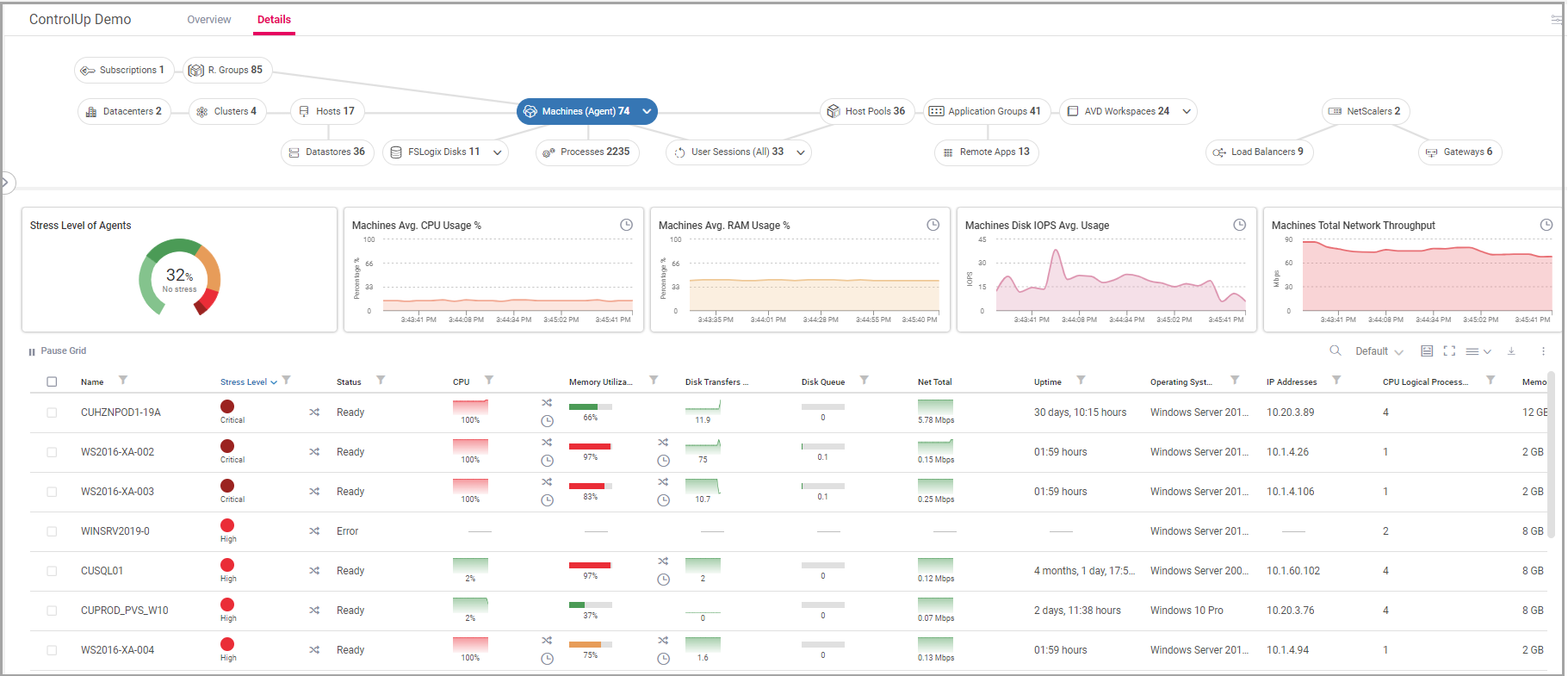
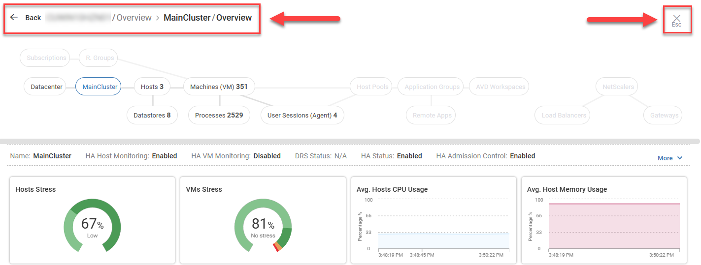
Discovery View with Topology
The Discovery View enables you to perform accurate investigations on real-time data. The data displayed provides you with accurate and targeted information on your systems so you can efficiently discover issues as they arise.
There are dedicated pages with specific widgets and columns depending on what you choose to highlight in the topology at the top of the screen.
Topology

The topology feature displays your organization visually, showing the connections between all the elements in your monitored environment. Each of the elements can be drilled down to provide you with more information and monitoring details.
When drilling down from the topology, the elements are displayed in the dashboard widgets and grid below.
When drilling down to objects in the dashboard or the grid, use the topology to navigate between the objects that are related to the element you drilled down to, both parent and child elements.
By default, if ControlUp Agents are installed on machines in your organization, the topology opens the Machines (Agent) drilldown. Click the arrow icon to select a filter.
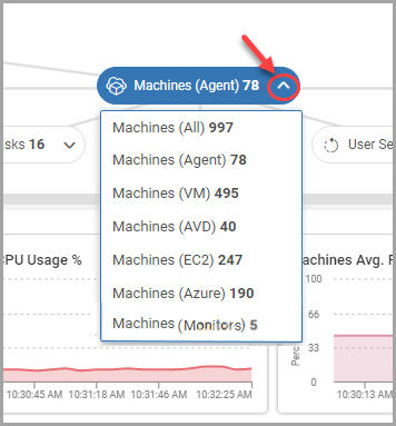
Depending on your organization, the Machines (Agent) widgets and grid filter options can include the following:
All. All VMs and physical devices, including without agents installed. Data from agents, hypervisors, and EUC environments.
Agent. Only VMs and physical devices with agents installed. Data from agents.
VM. Only VMs without agents installed. Data from hypervisors.
Horizon. Only Horizon VMs. Data from EUC environments.
AVD. Only AVD VMs. Data from EUC environments.
EC2. Only EC2 VMs. Data from EUC environments.
Azure. Only Azure VMs. Data from EUC environments.
Monitors. Only VMs and physical devices with ControlUp Monitors installed. Data from monitors.
Drilldowns
Click on a widget on the dashboard, or an entity in the real-time grid, to drill down and see more relevant information. The VDI App shows you the most relevant information based on what you drilled down into.
You can also drill down into specific metrics in the real-time grid. For example, click on a CPU metric for a machine to drill down into more CPU-related data for that machine. After you drill down, you can continue to navigate or drill down further until you get the required information.
At the top of the screen, you can keep track of where you have navigated. You can go back a step, or completely close out of the drill down to return to the location where you started the drill down. The topology at the top of the screen also changes based on what you might have accessed in the grid.
Azure drilldowns
For Azure machines resources, you can drilldown directly to metrics for a specific machine from selected bar graphs. To drilldown to a machine, select one of the following widgets:
Machines (AVD)
Machines (Azure)
Resource Groups
Subscriptions
Then select the bar of a machine name in one of the following bar graphs:
AVD Machines by Sessions
Top Machines by Cost
Total Machines by Cost
Top Resource Group By Cost
Grid, List, and View Options
![]()
Columns options include:
Search
Select column presets
Enlarge / Decrease column grid
Grid at full screen
Select columns
Export grid to file
Choose grid view
Selected Topologies offer the option to toggle between viewing metrics in a grid view or a list view.
If you find columns that you want to see that aren’t appearing in your view, you can search and add more columns. You can save your view and restore defaults to revert to the ControlUp suggested column view. You can also pause incoming metrics to the grid.
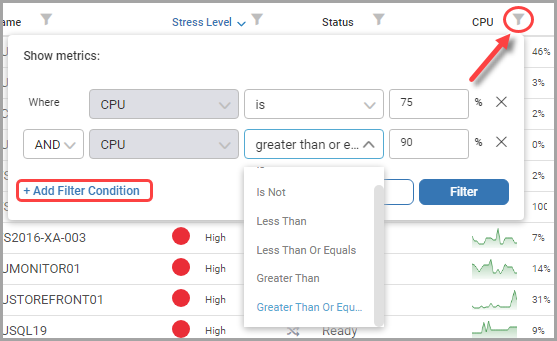
Filter
To filter items in a column, click the filter icon next to the column name, select the option from the dropdown (Starts With, Ends With, Is, Is Like, Is Not, Not Like, Less Than, etc.), and set the value. Click + Add Filter Condition to add additional conditions as needed. You can also filter out empty or null fields to exclude those from your filtered selection.
Tip
To run queries on specific lists only, use the default Starts With filter for applicable columns.
Views
For selected machines, you can view detailed information in widgets and a real-time grid in the following views:
Connected Data Sources. Metrics of data sources connected to monitor machines.
Disks. Metrics of logical disks attached to machines.
EUC. Metrics of EUCs.
FSLogix. Metrics of FSLogix disks attached to machines.
Registered Machines. Metrics of machine health.
Sites. Metrics of sites that monitor machines are connected to.
Monitors. Metrics of monitor machines.
Historical Trends
While the VDI App’s power lies in its real-time monitoring, you can also use it to view historical trends on any metrics related to machines and hosts. These metrics are available for single entities, multiple entities, and for the relevant Dashboard Widgets. See Historical Trends for full details on this feature.
Reports
Access VDI App reports to identify trends about user activity, system health, and application usage. Use the data from the report metrics to take actions to optimize your environment, and improve system functionality and the user experiences throughout your organization. For more details, see VDI and DaaS Reports.