One of the goals of this dashboard is to not only present the data but also to demonstrate how the data is retrieved using API queries. Each of the out-of-the-box widgets on the dashboard is fully transparent. You can click Edit to view the actual API query being executed via the Infinity plugin.
This is especially useful for technical users who want to understand where the data comes from, how it’s parsed, and whether any calculations are performed directly in Grafana after retrieval. These users may be able to use this information to build your own dashboards to display ControlUp data and make your own calculations once you understand how these widgets are configured.
VDI API
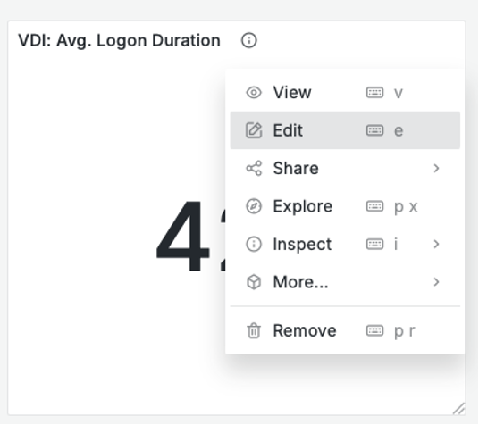
Let’s take a closer look at the widget VDI: Avg. Logon Duration. Right-click the widget and select Edit to view the details.
Here you can see the API call that retrieves the data for the widget:
.png)
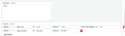
Under Parsing, you can see the path and the columns the API retrieves to display in the dashboard.
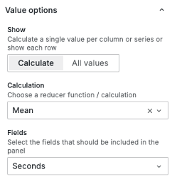
The data returns an average logon duration for each hour between the selected timeframes. Using the stat visualization under Value options, the average of these values is calculated and displayed in the dashboard.
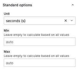
Under Standard options, the Unit selected is seconds.
Desktops API
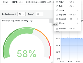
Let’s take a look at a more complex widget: Desktop: Avg. Used Memory. Right-click the widget and select Edit to view the details.
Here you can see the API call that retrieves the data for the widget: Data Access Layer (DAL) API query. This API enables calculations to be done on the data in ControlUp for Desktops and return a query answer as opposed to a data set.
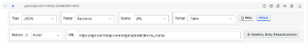
Because this is a POST from the DAL API, there is also a body with the query. Under URL Options, click Headers, Body, Request params. You can see the JSON body sent to the DAL API to get the correct answer to the query.
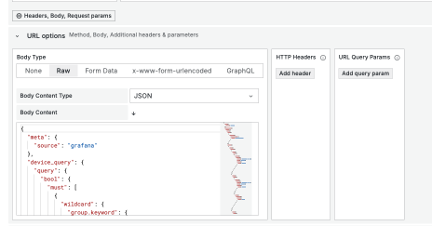
The DAL query has the following parts:
meta: Includes the source which in this case is Grafana. You can change this for your platform, for example to use PowerBI or Looker studio.
device.query: Looks at the filters on top of the dashboard. This query looks at Device Groups (${devicegroups} and Tags ${tags}. You can edit this query and add your own device group and tag. To get all devices, replace the variables with a wildcard (*).
data_query: (displayed below) This is where the real magic happens, where we calculate the data index, in this case device_status, for the correct answer to the query.
{
 "data_query": {
    "size": 0,
    "query": {
      "bool": {
        "must": [
          {
            "range": {
              "_created_local": {
                "gte": "${__from:date}",
                "lte": "${__to:date}"
              }
            }
          },
          {
            "exists": {
              "field": "memory_available_percentage"
            }
          }
        ]
      }
    },
    "aggs": {
      "avg_free_memory": {
        "avg": {
          "field": "memory_available_percentage"
        }
      }
    }
  }
}
The data query retrieves a range of records based on the selected Grafana time frame, using greater than or equal to (gte) and less than or equal to (lte) conditions. You can adjust this time frame to suit your own needs. Within that range, the query targets the column memory_available_percentage and applies an aggregation (aggs) to calculate the average (avg) value.
These types of Data Access Layer (DAL) queries follow an Elasticsearch-style structure and can also be written using AI tools like ChatGPT or Google Gemini. They can work across any of our ControlUp data indexes.
For more technical details, visit the official API documentation: https://api.controlup.io/reference/get-scoped-data-index
Transformations
Some widgets in Grafana make use of transformations to adjust or clean up data before it’s visualized. A good example is the widget: Desktops: P95 DEX Score.
By default, the DEX Score is returned by the DAL API as a value in thousands so a score of 8 is returned as 8000. To display this correctly in Grafana, the value has to be divided by 1000.
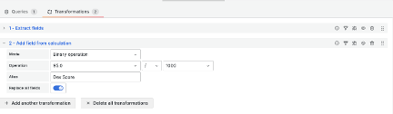
In the widget’s Edit screen, you can navigate to the Transformations tab to see if any transformations are applied. In this example, the two transformations are:
Extracting the P95 data field from the query result.
Applying a calculation that divides the P95 value by 1000, converting it to the correct scale for display.
These transformations make the data more readable and ensure that the dashboard reflects accurate, human-friendly values.