The Machine Trends report shows historical information about resource consumption trends for monitored machines by summarizing performance metrics for different machines during the selected time period. By default, the selected time period is the previous 24 hours.
Use the report to answer questions such as:
What was the average CPU utilization in the server farm this morning?
Which machines had the highest GPU utilization last week?
What was the peak I/O utilization of SERVER05 yesterday?
Which process caused irregular RAM consumption on the file server?
To learn more about the Machine Trends report, watch our video.
Report Functionality
The report provides the following functionalities:
Displays data in two views:
By folder. View data for all managed machines in a specific ControlUp folder. By default, the report displays machine trend data for your entire organization. You can select up to 4 folders.
By machine. View data for a specific managed machine(s). You can select up to 10 machines.
You can click a data point in the charts to view the minimum, average, and maximum values for each data series, the number of instances the metric is based on, machine utilization range (%), and the machine or process names of the top consumers.
You can toggle between the Top Consumers list and the Distribution graph (Machine Utilization Range) for each data point, and view values for earlier or later data points by clicking the arrows next to the timestamp, see below.
You can click a process name to view the App Trends report of the process on the selected machine(s).
You can click a data series name on the bottom of the chart to highlight or toggle the series on the charts.
The report displays the following charts:
CPU Utilization
Use the CPU Utilization widget to monitor average CPU usage. The chart displays data measuring the percentage of total server CPU capacity in use. CPU usage data can help you optimize the performance of your system by identifying potential resource bottlenecks and ensuring that your CPU is used efficiently.
For example, clicking a specific data point on the CPU Utilization chart shows that two machine instances consumed 99% of the selected folder's CPU: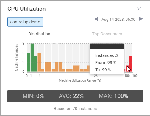
GPU Utilization
Use the GPU Utilization widget to monitor average GPU usage. The chart displays data measuring the percentage of total server GPU capacity in use, including GPU video decoder usage, GPU video encoder usage, and NVIDIA frame buffer usage. GPU usage data can help you optimize the performance of graphics cards in your system by showing how much GPU individual running machines or processes are using. If you select the folder view, the chart displays data from all managed machines with and without GPU.
Memory Utilization
Use the Memory Utilization widget to monitor average RAM usage. The chart displays data measuring the percentage of total RAM capacity in use. Memory usage data can help you optimize the performance of your system by showing how much RAM individual running machines or processes are using.
Disk I/O Utilization
Use the Disk I/O Utilization widget to monitor average disk I/O usage. The chart displays data measuring the total I/O operations per second generated by processes, tracking the average I/O usage for all selected application instances over time. Process I/O metrics shown include all I/O activity combined (file, network, and device I/O). Disk I/O usage data can help you optimize the performance of your system by showing the rate that individual running machines or processes are generating I/O operations.
The Disk I/O Utilization widget and Min/Max banner show the machine's disk activity.
The Top Consumers list shows each process's total I/O.
Network Usage
Use the Network Usage widget to monitor average network usage. The chart displays data measuring the total sent and received KB per second generated by processes. Network usage data can help you optimize the performance of your system by showing the rate that individual running machines or processes are sending and receiving data.
User Sessions
Use the User Sessions widget to monitor user sessions. The chart displays data measuring the total number of sessions established by machines. Session data can help you optimize the performance of your system by showing the amount of user sessions each machine established.
CPU Ready Time
Use the CPU Ready Time widget to monitor the ready time of tasks waiting to be processed by the CPU. The chart displays data measuring the percentage of time between when the VM was ready to process a task, but waited to run on the physical CPU at the selected time. CPU ready time data can help you determine how efficiently your system performs, track resource utilization, and avoid errors caused by high CPU ready values.
Disk Queue Length
Use the Disk Queue Length widget to monitor the I/O requests. The chart displays data measuring the average number of I/O requests waiting in the disk queue of machines. Disk queue length can help you determine if the specific storage volume is handling request rates efficiently, and detect disk performance issues.
Disk Free Space
Use the Disk Free Space widget to monitor the amount of free space remaining on the system disks of machines. The chart displays data measuring the current available free space for specific disks or partitions in machines. Disk free space can help you to monitor storage capacity and detect when disks are running low on space.
Processor Queue Length
Use the Processor Queue Length widget to monitor the number of threads waiting to be processed by the CPU of machines. The chart displays data measuring the total number of threads that are ready to run on the processor, but can't due to another active thread. Processor queue length is vital to help you detect processor overloads.