Historical data is available in our VDI App UI only if you use ControlUp Hybrid Cloud. If you use ControlUp On-Premises, use Insights On-Premises to see historical data.
You can view historical trend data directly within the VDI App interface. When you see a metric you want to investigate further, you can select to view historical data for the past several days.
Historical data is available for metrics that are related to:
- Machines that have the ControlUp Agent installed
- Sessions running on machines with the ControlUp Agent installed
- Hosts that are monitored in your ControlUp environment
You can view historical trends for:
- A single entities (such as a machine) in the grid of the Discovery view
- Multiple entities (such as multiple machines) in the grid of the Discovery view
- Dashboard widgets in the Dashboard view or the Discovery view
For details on how to view full reports on historical data in the VDI App, see Historical Reports.
Single Entity
You can view historical trends for a single entity, or a specific metric within an entity.
Let's say you have a machine or session that is showing over 90% percent CPU usage and you want to know for how long it has been performing at that state.
To view historical trends for a single entity:
From the real-time grid on the Discovery page, right click on a row and click Historical report.
To view historical trends for a single metric:
Hover over a metric and click the clock icon to see historical data for only that metric.
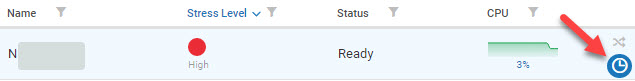
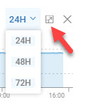
An overlay displays the selected metric for the past 24 hours. You can also select to view 48 or 72 hours.
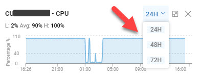
You can click on the arrow icon next to the hours selection to expand the overlay and open the historical trend page for the entity.
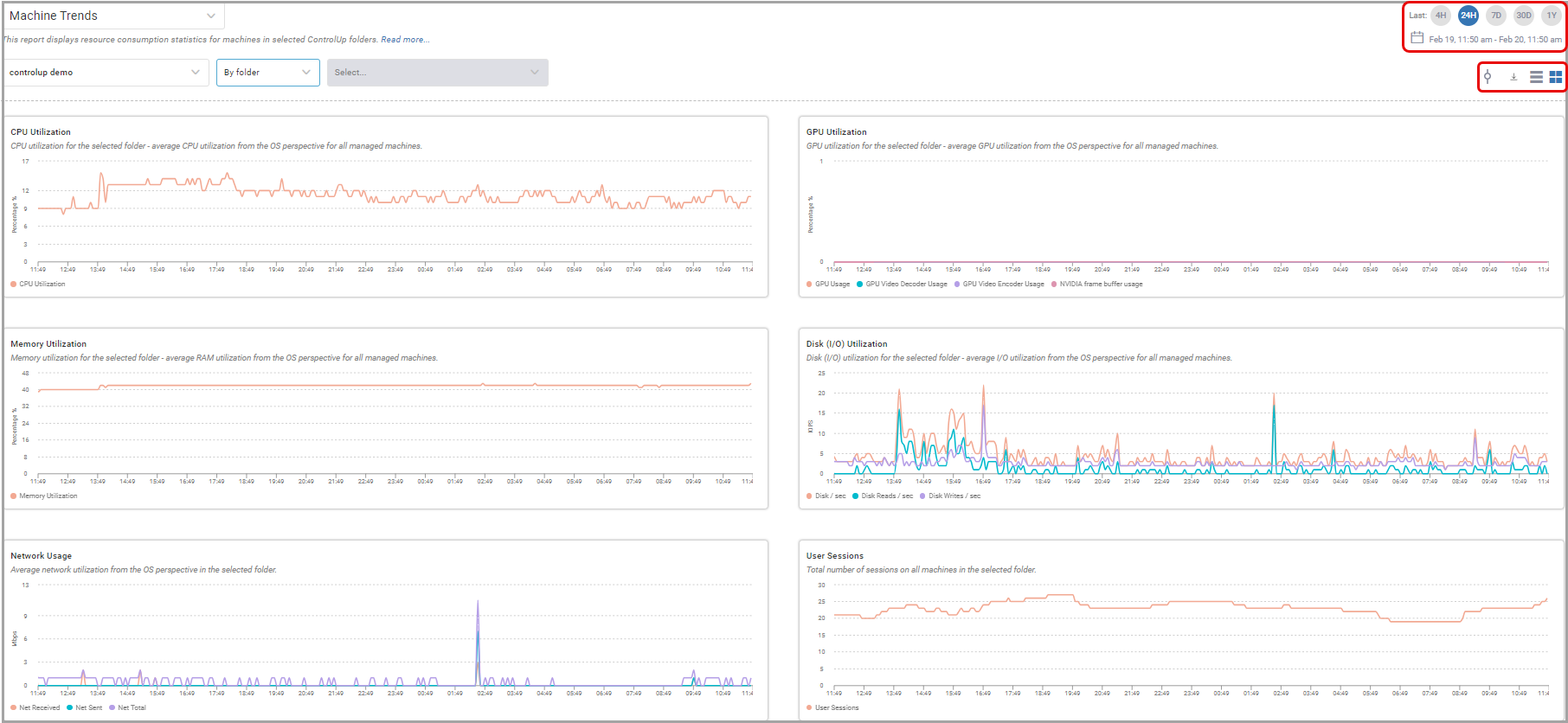
Historical Trends Page
In the historical trend page opened using either of the methods above, you can see historical data on several metrics for the host, machine, or session. For example:
- CPU Utilization
- Memory Utilization
- I/O Utilization
- Network Usage
- User Sessions
You can select to view the graphs in boxes or in a row. You can also select to view the data for the past 24 hours, 72 hours, 1 week, or 1 month.
Multiple Entities
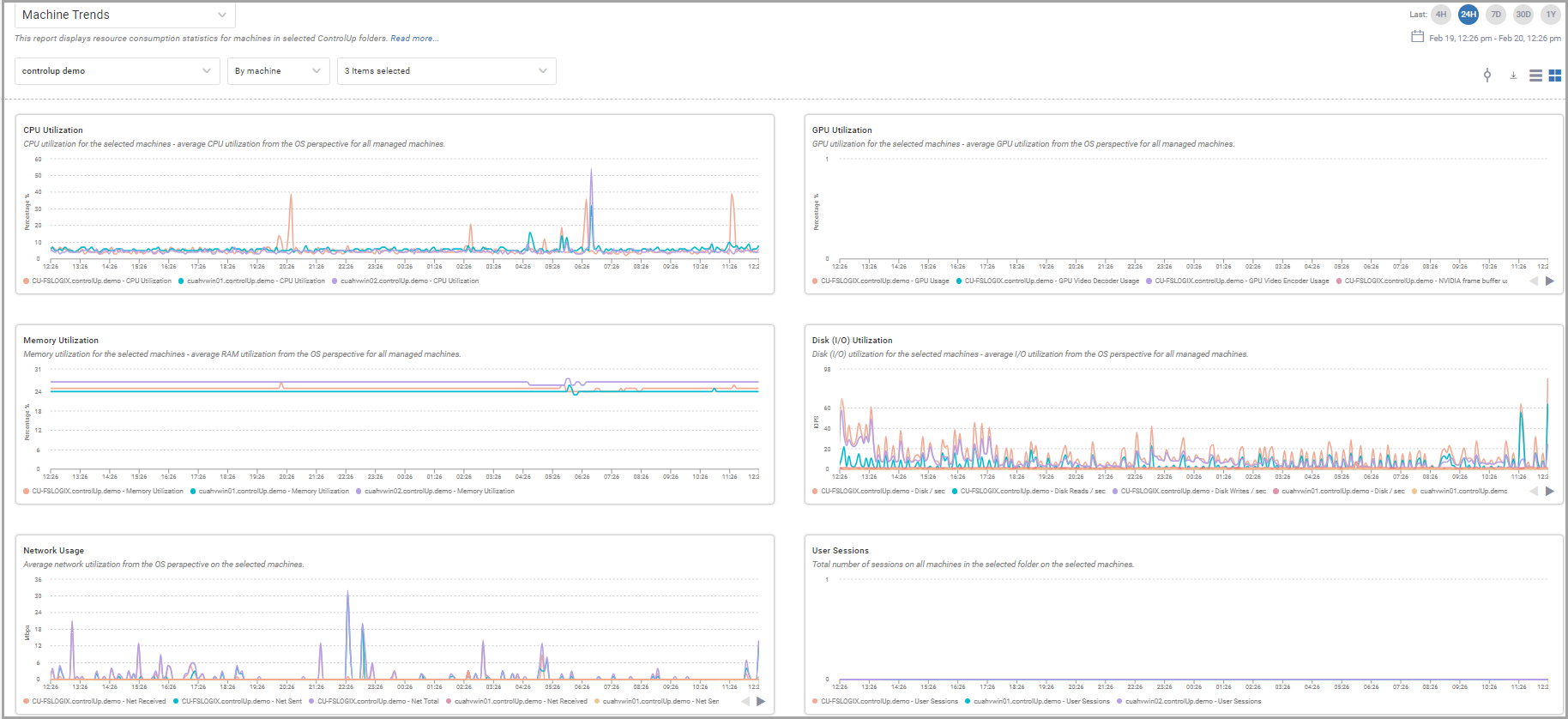
You can view historical trends for up to 10 entities in the Discovery view grid. This is useful if you want to see a comparison between the metrics for several entities over time.
Note that you can't compare session metrics in the same way. Selecting multiple sessions brings you to a different historical page (Session Activity) than selecting a single session (Session Details).
To view the historical trend for multiple entities:
- Hover over the area of the grid to the immediate left of the object's name and click to select that object.
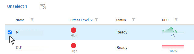
- Repeat for all the objects you want to select for this historical trend view.
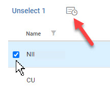
- Once you have made all your selections (of only up to 10 objects), click the Trends icon at the top of the grid or right click one of the selected entity and click Historical Reports.
The Trends window opens displaying the metrics for all the selected machines, represented by different colors for each object in each graph.
If you click the clock icon  next to one of the entities selected, even if multiple entities are checked as selected, the historical trend view opens for just that entity. You must click the Trends icon at the top of the grid, or right click and select Historical Reports, to get the multiple historical view.
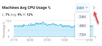
Dashboard Widgets
The relevant Dashboard Widgets in both VDI App's Dashboard view and Discovery view include the ability to view historical trends. The widget's data has to be mapped to the monitoring information for machines or hosts. The relevant dashboards widgets include Machines Average CPU Usage, Machines Total Network Throughput, Hosts Average RAM Usage and more.
You can identify a relevant widget if you see the clock icon in the right side of the widget.
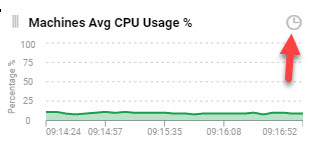
When you click the clock icon, the widget flips over to the historical trend view where you can select from the most previous 24, 48 or 72 hours. To return to the real-time view, click the open triangle to the right of the hour selection.